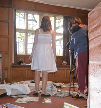
 From the preliminary task I
learnt a lot about filming and how to make it to a high standard, which I took
forward with me when filming our opening. The main feedback from our
preliminary was that are camera shots were too wobbly and not still, so on the
day of filming we filmed most of our footage using the tripod. By doing this
our footage was not wobbly and made it look like a real film. Also it made the
framing of a shot a lot easier as we were able to keep able the camera in the
same place every time we filmed a shot. There only a couple of shots were we
didn’t use the tripod. They were; the from the floor of the girl walking across
the room with only her feet in shot, it wasn’t necessary to uses the tripod as
we had the camera on the floor and the panning shot from the dead girl to a
close-up of the girls hand, for this shot is was a lot easier to do it hand
held as we wanted to a panning shot with zooming that was really smooth.
 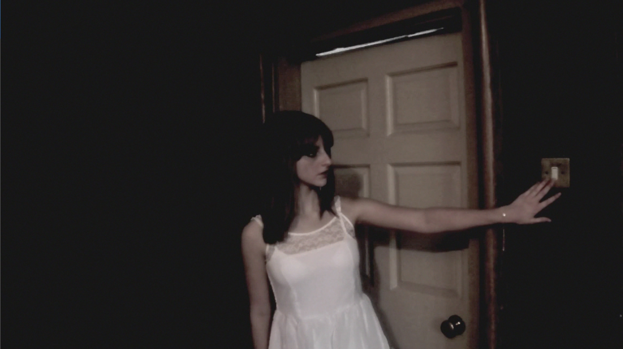 When filming we weren’t able
to do much with our lighting, as we didn’t have the right equipment. The only
thing we could decide was if we used just natural light or if we switched on
the lights in the house. Mainly we used natural lighting, as when we filming it
was a nice, sunny day. The only time we used the lights in the house was in the
room. We used electrical lighting for these shot so the audience we able to
see, in detail, everything that was in the room. However, when editing we felt
the shots weren’t dark enough for the storyline, so we added an effect called
‘Bleach Bypass’ to make each shot
darker. This work really well, it fitted well with the storyline and helps to
make the fake blood look more realistic.
Camerawork
I have learnt and developed
my skill a lot since the preliminary task. By doing this, I think we shot and
edited very effectively. To ensure we
did this correctly we spent a lot of time how each shot would look when planning
and on the day of filming. I have picked three examples that I believe shows we
have a good understanding of how a shot should look.
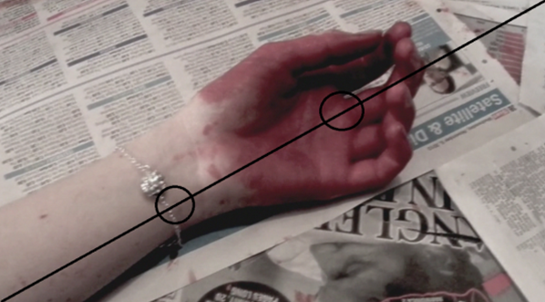
This
is the very first shot in our opening. It is a close-up of the girl’s bracelet
and bloody hand. This shot follow the structure of the golden mean, which is
where the point of interest in the shot occurs over an imaginary diagonal
line. The point of interest in this shot
is the bloody hand and the bracelet. We created this shot because it instantly
gets the audience attention and makes them interested in what is happening.
Also it creates a lot of mystery as the audience don’t know who hand it is or
who blood it is. The composition for this shot is important, as there in
nothing in the shot other than the arm and newspapers. We did this because we
wanted the audience just to focus on the arm with the bracelet and nothing else. Also the
newspaper relates to all the rubbish in the room.
These two shots show how we
used continuity well and followed the structure of the rule of thirds. In this sequences the front
door slams and the girl turns around in shock. The two shots we used was the girl
turning away from the camera to look at the door followed by a quick cut girl
looking at the camera where the door is. In editing, we able to get the shots
to match each other really well, when watching it the audience wouldn't know
that they film at two separate times. The continuity of the shots are perfect,
even down to the way girls hair turns as she turns. These shot also show how we used the rule of thirds,
which is where the point of interest happens within a box on a grid (as shown
above). In these two shots the point of interest is the girl turning reacting
to the door slamming. We did this
because it shows the audience that the girl was scared, which makes them
sympathize with her when she is killed, so it was important that in these shots
the girl was the point of interest. Also
the fact that nothing else of interest are in these shots, makes the girl stand
out even more.
When
the girl enter the room we used a panning shot, showing the room in more detail. This shot shows how we used framing and composition
in our opening. When planning we wanted
to create room that looked dirty, old and unloved to build tension. So we
gather lots of different items that would help show this. On the day of film we
took out all the chairs and tables and filled the room with rubbish, a mattress
fake blood and sheets. For the composition we
chose to show all of the room with all of the rubbish. We did this so the audience
could see what the girl was seeing and therefore they would have a better
understanding of the situation. As for
the framing we used a panning shot , as we felt it was the best shot to show the room in detail. Also it is a
common shot used in thriller when establishing the location.
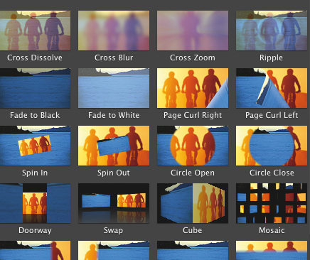 From the preliminary task, I
had the basic skill on how to use imovie. This developed when creating our
opening, which helped a lot when creating certain moods within our opening. We
didn’t use main transitions in our preliminary and in our feedback that was a
suggested improvement. So, in our opening we used a great deal of transitions
mainly in the build up to the girl’s deaths. There are a lot of still images
shown in a very short amount of time and it help create confusion and add
tension we used the transition called ‘fade to white’ which looks like a the
girl is having a number of flashback from all the things she has seen in the
room. This had a big impact in building the tension and making the audience
feel on edge. The other time we used transition was when the opening cut to our
titles, in this we used ‘fade to white’ and then ‘cross dissolve’. We did this
because it helps make the title look more professional and help to make the
whole sequences look smoother. Also we used a transition at the end of our
opening called ‘fade to black’ . We did this because it was an appropriate way
to end the opening as it shows the audience that it is the end which finishes
on a cliff hanging, so the audience would want to watch the rest of the film.
Another skill I developed
when creation the opening was using and editing sound. As we had non-diegetic sound playing
throughout the whole opening and only a couple of sections diegetic sound, it
was important to get sound effects that really helped to create the mood of the
opening. One of the diegetic sounds we used in the part where the girl was
walking up the stairs was originally four minutes long and about every 20
seconds in the track a couple of piano notes would play which ruined the
atmosphere the sound helped to create. So on iMovie we edited the sound down to
about sixteen seconds which fitted perfectly and got rid of the sounds of the
piano notes we didn’t want. As well as this, I learn how to layer the sound on
iMovie which was very important in making the sound running smoothly. An
example of when we did this was when the girl was walking up the stair and
walking toward the door. We layer the sound of a high-pitch string section with
a low pitched symbol section. By doing
this both sounds worked really well together in creating tension and
atmosphere.
When editing we had a big
issue that the original cut was four minutes and forty-six seconds long, which was too long, not
interesting enough to watch and didn’t create enough tension. So we deleted all
the footage that takes place outside of the house (see the storyboard for more
detail) and sped up certain shots
(mainly the shots of the girl walking up the stairs). But the biggest change
was the build up to her death, before we
had a very slow sequences of the girl looking at the table and so we change it
to a very quick showing of images that relate to the narrative. Also we added
an effect to each shot called ‘Bleach Bypass’. We did this to make each shot
darker, as our lighting was to bright, which help to build tension and made the
whole opening seem more sinister. By
doing this, we now had an opening that was two minutes and twenty-four seconds,
did build tension throughout and made the audience interested to watch from the
very first shot.
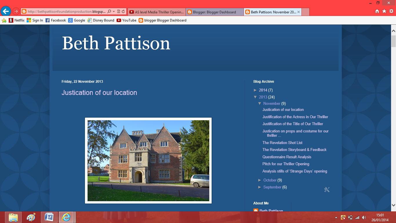 I did other programs to help
our group in creating our opening. The main program I used was Blogger, this
was a very simple but effect way for me to show all the worked we did in
creating this opening and it also allowed me to see what parts of my work need
in improving. Another helpful website was ‘wordle’ which I used in creating
this evaluation as it is more interesting that just reading lots of texts. I
also used Facebook to get feedback from our audience on the storyboard and the
final opening.

No comments:
Post a Comment