Friday, 24 January 2014

Question 7: Looking back at your preliminary task, what do you feel you have learnt in progression from it to the full prouduct?

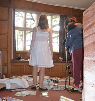
During this whole experience I have learnt and developed so much as film maker. I now appreciate how much hard work goes into creating a film. Now I have a full understanding how vital planning really is. From our audience research, we learn what type a thing people wanted in a thriller, which inspired us when creating a storyboard and it help use to create an opening people enjoyed watching. With the storyboard and shot list I am glad we spent so much time into putting a lot of detail into it as this made the filming day a lot easier. On the day of filming, we spent time putting each shot together before we even started filming, from creating a messy room to covering up the fire extinguisher in the house. Then when filming I learnt how important to film each shot more than once, as when we looked back at each sequence there was thing we had to change or add in (for example for a couple of shot we forgot that the girl need to wear the bracelet, which if we hadn’t looked back at, we wouldn’t of notices). Also I learnt how much a tripod can make a big difference in making each shot look steadier, as we didn’t really use it our preliminary task which made it look amateurish but we used it all the time in our opening and it really made the whole thing look more professional.  When editing I learnt a lot, including that something may look good when planning but it may look bad once you get it into editing. For example we thought a couple of shots from outside the house before the girl entered would help establish the location. But actually it was boring sequences to watch, as nothing was really happening, so the audience would disconnected from our film and less likely to keep watching, so we deleted it in editing.

In our preliminary task there was number of things that went well. This includes;
·         The composition and framing of each shot was correct in our opening- we didn’t have an unnecessary thing in the shot and it was very easy for the audience to understand what was happening in each shot.

·         The editing of the preliminary- we edited the preliminary really well, we were able to follow the 180° rule, have match on action,  shot revers shot and continuity. 

·         A variety of shots- We did have lots of different shots in preliminary task including;  including high angled, low angled, mid shot, close ups and extreme close up, all of which fitted perfectly into what was happening in the scene.

However there was also a lot we needed to improve on from our preliminary task;

·         Spend more time filming carefully and use the tripod more so the shot won't be as unbalanced-We did this in our opening by spending time planning different shots we could use in our opening, which we then did when filming.

·         Ensure that the credits don't go so quickly and the audience can understand what they say- We did this in our opening by using a different credits style which lasted longer and suited the thriller genre more.

·         When planning and editing think more about transitions and use them more-We didn’t really do this when planning, but when we edited we add lots of different transition, especially in the build up to the girl’s death.  

·          Spend more time on the storyboard and shot list, so we know exactly what shots need to be filmed and how we will film them- we did spend a lot time on the storyboard and shot list, which did make filming these shots a lot easier for our group.

 
When creating the preliminary we had to include the following; shot reverse-shot and match on action. Also we had to make sure we didn’t break the 180° and that the sequences followed the continuity rule. I found this very hard to originally, as before starting the producing I didn’t know what any of those were in film making. But once we had the chance to plan how we were going to show these skills it became a lot easier and we did do all of them. So it was important when creating our thriller opening to show and improve these skills. We didn’t use shot reverse-shot as we felt it wasn’t necessary to our storyline and wouldn’t have helped to create tension. But we did use match on action; a good example of this is when the girl opens the door to enter the room. We were able to edit so well that it just looks like it was normal action and not one we had to stop and start a number of time. Also we didn’t break the 180° rule and all of the sequences followed continuity rule. A good example of when we followed both of these rules was the sequences of the girl walking up the stair, there are a number of different shots in the sequences all of which follow each other perfectly as we made sure the girl used the same foot per step of each shooting and she is always on the same side of the stairs.
Another really important factor to our filming was we wanted continuity to be perfect. This was a challenge, as when the girl was walking we had to make sure she started and finished on the same feet in each shot. To do this properly we spent a lot of time working out with the actress what foot to use at different points and between filming we looked at our footage ensuring it followed continuity (and re-filming shots if the footage didn’t). I think by doing this (with the help of editing) our continuity was perfect, with no shots in our opening that didn’t make sense. 


We felt as a group that we didn’t have enough variety of shots from our preliminary task, so when creating our opening it was essential we had lots in our opening. We spent a lot of time on this when creating the storyboard and even on the day filming we add shots to ensure we had enough variety. By doing this we in our opening we had; mid shots, close ups, panning shots, low angle shots, long shots, extreme close up and over the shoulder shots.  For our opening we used specific shots to help create a feeling of tension and mystery throughout. So, when the opening begins there are a lot of mid shots and long shot of the girl. We did this to help keep the distance between her and the audience-it created mystery and does not allow the audience to connect to her. As she is walking up the stair, there are some unusual shots of the girl’s feet and low angle shots that follows her as she goes up the stair. We did this to introduce the idea that the girl is being watched and she is not alone in the house. This raises the tension and creates a creepy atmosphere.  When she enter the room there are shot taken from her point of view, so the audiences start to see and feel what the girl does (it also help to show more detail of the room). 
 

Then the build up to her death there are lots of different, obscure shot in a very short space of time. This helps to build up to the climax and connects all of the different thing within the room to the girl (e.g. the doll, the dead images of the girls and the bracelet). Also it makes the audience anxious and confused as they start to realise something major is going to happen-but they don’t know what. During the shooting, there is only close-up of the girl face and of the blood from the shot wound. This is the first time the audience get to see the girls face in detail which make them connect and sympathize with her as they can see her emotions clearly. We showed the blood from the bullet wound so the audience would understand exactly what had happen to the girl and it made the sequences uncomfortable to watch (something which is done a lot in thriller films). Once she had the girl had died, we used another panning shot of her body to a close up of her hand. We did this to suggest that murderer was looking over their victim and to slow everything down after the very fast paced sequences.

I think there a number of things we did really well in our opening; this includes;

·         The steadiness of each shots- for our preliminary task one of main criticisms we got was our shots were very wobbly. So in our opening we made sure we used the tripod as much as possible. By doing this, all of shots  look very professional and there wasn’t one shot in the opening that looked wobbly.

·         The way tension is build- In our opening I think we created tension really well which help to make it look like a thriller opening. We did this by using lots of different sounds, making the editing fast-pace towards the climax of the story and by placing lots of different item around the room to suggest sinister things.

·         The mystery created-In most thriller films a mystery follows the storyline which isn’t revealed until the end of the film. So when creating our opening we wanted to do something similar and the main way we did this was by not explaining to the audience why the girl was at the house, who the girl was, who killed the girl or who own the room the girl was looking around.  By doing this, it makes the audience want to watch the rest of the film to find out the answers to those questions. Also it helps to create an interesting storyline.


·         Our editing- the editing for the piece, I think it really strong. When we did a first cut of our opening was four minutes and forty-six  seconds long, which was too long, not interesting enough to watch and didn’t create enough tension  because the editing was poor and the opening wasn’t to a high standard. But, we worked on the time of the sequences by; deleting certain footage (like the shots taken from) outside of the house, sped up certain shots (mainly the shots of the girl walking up the stairs) and changing the build up to  the girl's death to a very quick showing of images that relate to the narrative By doing this we had an opening that had lots of transition, follow the continuity rule well and had cuts with in that really helped to build tension.

                                                                              
·         Good shots the fitted perfectly with the storyline- for our opening we used certain shot to create certain feelings. By doing this we had mid shots, close ups, panning shots, low angle shots, long shots, extreme close up and over the shoulder shots-all of which fitted well with our storyline and did help to create tension.

However, I also think that if we going to make this opening again there would be a couple of thing I would improve; this includes;

·         The effect used on each shot- Although the effect we used of each shot help to make the opening more dark and sinister, it wasn’t the same colour for every shot. For example; when the girl enter the house the shot are nearly black and white but when she enter the room the shots are coloured.  So if we were going to do the opening again I think we should film at night time with the correct lighting equipment so we wouldn’t need to add an effect to each shot but it still be dark enough to create the sinister feeling.

·         The sound- I do think our sound worked for our opening but it wasn't perfect for a real film and was weaker at some  in the opening compared to parts of the opening. For example I don’t think the heart beat from the build up to the girl’s death was strong enough for what was happening. So if we going to create the opening again I would suggest that we record our own music, that way we can create exactly what we want and don’t have to rely on music made by someone else.

·         Our title- The idea of having each member of our group as a photo actually in the opening worked really well-it connected them both. But I didn’t like the fact our names were added on in editing- as we didn’t do this for the titles. So if we going to do the opening again, I think we should write our names by the photos on filming days so we wouldn’t add anything in editing.


Question 6: What have you learnt about technologies from the process of constructing this product?


From the preliminary task I learnt a lot about filming and how to make it to a high standard, which I took forward with me when filming our opening. The main feedback from our preliminary was that are camera shots were too wobbly and not still, so on the day of filming we filmed most of our footage using the tripod. By doing this our footage was not wobbly and made it look like a real film. Also it made the framing of a shot a lot easier as we were able to keep able the camera in the same place every time we filmed a shot. There only a couple of shots were we didn’t use the tripod. They were; the from the floor of the girl walking across the room with only her feet in shot, it wasn’t necessary to uses the tripod as we had the camera on the floor and the panning shot from the dead girl to a close-up of the girls hand, for this shot is was a lot easier to do it hand held as we wanted to a panning shot with zooming that was really smooth.

When filming we weren’t able to do much with our lighting, as we didn’t have the right equipment. The only thing we could decide was if we used just natural light or if we switched on the lights in the house. Mainly we used natural lighting, as when we filming it was a nice, sunny day. The only time we used the lights in the house was in the room. We used electrical lighting for these shot so the audience we able to see, in detail, everything that was in the room. However, when editing we felt the shots weren’t dark enough for the storyline, so we added an effect called ‘Bleach Bypass’  to make each shot darker. This work really well, it fitted well with the storyline and helps to make the fake blood look more realistic.

Camerawork

I have learnt and developed my skill a lot since the preliminary task. By doing this, I think we shot and edited very effectively.  To ensure we did this correctly we spent a lot of time how each shot would look when planning and on the day of filming. I have picked three examples that I believe shows we have a good understanding of how a shot should look.

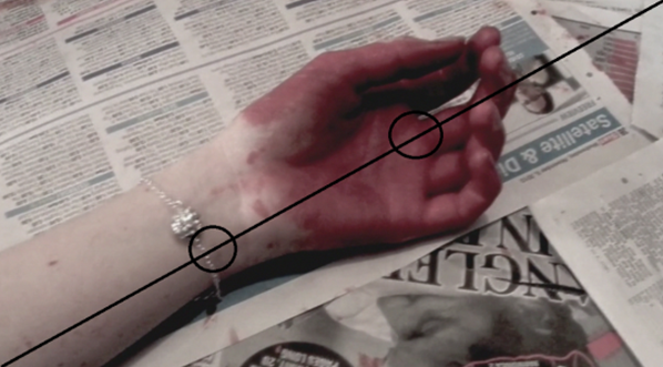
This is the very first shot in our opening. It is a close-up of the girl’s bracelet and bloody hand. This shot follow the structure of the golden mean, which is where the point of interest in the shot occurs over an imaginary diagonal line.  The point of interest in this shot is the bloody hand and the bracelet. We created this shot because it instantly gets the audience attention and makes them interested in what is happening. Also it creates a lot of mystery as the audience don’t know who hand it is or who blood it is. The composition for this shot is important, as there in nothing in the shot other than the arm and newspapers. We did this because we wanted the audience just to focus on the arm with the bracelet and nothing else. Also the newspaper relates to all the rubbish in the room.

 
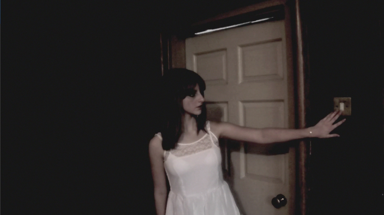
These two shots show how we used continuity well and followed the structure of the rule of thirds.  In this sequences the front door slams and the girl turns around in shock. The two shots we used was the girl turning away from the camera to look at the door followed by a quick cut girl looking at the camera where the door is. In editing, we able to get the shots to match each other really well, when watching it the audience wouldn't know that they film at two separate times. The continuity of the shots are perfect, even down to the way girls hair turns as she turns. These shot also show how we used the rule of thirds, which is where the point of interest happens within a box on a grid (as shown above). In these two shots the point of interest is the girl turning reacting to the door slamming.  We did this because it shows the audience that the girl was scared, which makes them sympathize with her when she is killed, so it was important that in these shots the girl was the point of interest.  Also the fact that nothing else of interest are in these shots, makes the girl stand out even more.

When the girl enter the room we used a panning shot, showing the room in more detail.  This shot shows how we used framing and composition in our opening.  When planning we wanted to create room that looked dirty, old and unloved to build tension. So we gather lots of different items that would help show this. On the day of film we took out all the chairs and tables and filled the room with rubbish, a mattress   fake blood and sheets. For the composition we chose to show all of the room with all of the rubbish. We did this so the audience could see what the girl was seeing and therefore they would have a better understanding of the situation.  As for the framing we used a panning shot , as we felt it was the best shot  to show the room in detail. Also it is a common shot used in thriller when establishing the location.      

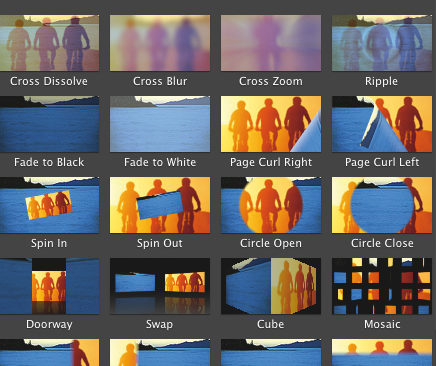
From the preliminary task, I had the basic skill on how to use imovie. This developed when creating our opening, which helped a lot when creating certain moods within our opening. We didn’t use main transitions in our preliminary and in our feedback that was a suggested improvement. So, in our opening we used a great deal of transitions mainly in the build up to the girl’s deaths. There are a lot of still images shown in a very short amount of time and it help create confusion and add tension we used the transition called ‘fade to white’ which looks like a the girl is having a number of flashback from all the things she has seen in the room. This had a big impact in building the tension and making the audience feel on edge. The other time we used transition was when the opening cut to our titles, in this we used ‘fade to white’ and then ‘cross dissolve’. We did this because it helps make the title look more professional and help to make the whole sequences look smoother. Also we used a transition at the end of our opening called ‘fade to black’ . We did this because it was an appropriate way to end the opening as it shows the audience that it is the end which finishes on a cliff hanging, so the audience would want to watch the rest of the film.

Another skill I developed when creation the opening was using and editing sound.  As we had non-diegetic sound playing throughout the whole opening and only a couple of sections diegetic sound, it was important to get sound effects that really helped to create the mood of the opening. One of the diegetic sounds we used in the part where the girl was walking up the stairs was originally four minutes long and about every 20 seconds in the track a couple of piano notes would play which ruined the atmosphere the sound helped to create. So on iMovie we edited the sound down to about sixteen seconds which fitted perfectly and got rid of the sounds of the piano notes we didn’t want. As well as this, I learn how to layer the sound on iMovie which was very important in making the sound running smoothly. An example of when we did this was when the girl was walking up the stair and walking toward the door. We layer the sound of a high-pitch string section with a low pitched  symbol section. By doing this both sounds worked really well together in creating tension and atmosphere.

When editing we had a big issue that the original cut was four minutes and forty-six  seconds long, which was too long, not interesting enough to watch and didn’t create enough tension. So we deleted all the footage that takes place outside of the house (see the storyboard for more detail)  and sped up certain shots (mainly the shots of the girl walking up the stairs). But the biggest change was  the build up to her death, before we had a very slow sequences of the girl looking at the table and so we change it to a very quick showing of images that relate to the narrative. Also we added an effect to each shot called ‘Bleach Bypass’. We did this to make each shot darker, as our lighting was to bright, which help to build tension and made the whole opening seem more sinister.  By doing this, we now had an opening that was two minutes and twenty-four seconds, did build tension throughout and made the audience interested to watch from the very first shot.

I did other programs to help our group in creating our opening. The main program I used was Blogger, this was a very simple but effect way for me to show all the worked we did in creating this opening and it also allowed me to see what parts of my work need in improving. Another helpful website was ‘wordle’ which I used in creating this evaluation as it is more interesting that just reading lots of texts. I also used Facebook to get feedback from our audience on the storyboard and the final opening.  

Question 5: How did you attract/address your audience?


Question 4: Who would be the audience for your media product?


Our target audience for our opening was teenagers. We chose them because our production team are all teenagers, so we know what types of thing they like/dislike meaning we would produce something that they could relate to and enjoy. Also teenager do watch a lot of thriller films to escape the classic children films and see a more realistic views of the world, while getting a lot of joy and excitement out of them. The age range we are looking at are 15-18 as this is the age people really start to watch more disturbing and shocking films. We aimed our opening for both genders, as psychological thriller don't have narrative that is genre specific (like a love story for girls), they care more about the plot-twists and the shocking elements within the film, something we did in our opening.  Our audience uses social networks, like Twitter and Facebook, they are interested in show like 'Breaking Bad' and 'Sherlock' and will only watch films that have unpredictable storyline, have good actors in them and are original-nothing like they have ever seen before.   Other types of thriller films they would enjoy are; 'The Dark Knight', 'Pulp Fiction' and ‘Black Swan'.

We researched in our audience by doing a questionnaire. We did ask a range of different people, but all the people we asked aged 15-18 all showed similar interest in thriller films.  We learnt they like psychological thrillers, with weapon, blood and dead bodies. Also we learnt they didn't have a preference in what gender the antagonist and protagonist should be. From this we created a storyboard, where we asked three very different teenagers their opinion of our storyline. We mainly got positive feedback and we learnt that teenager do really like a good plot-twist, suspense and mystery.

The British Board of Film Classification (BBFC) is responsible for the national classification and censorship of films within the United Kingdom. I think they would rate our film a 15.  I think this because it does contain a murder, which shows blood and dying of a young women and it deals with a very serious subject of violence’s, death and murder-both of which a child shouldn't be exposed to at a young age. Also the way we build up the tension in the opening with the music, the dark lighting would be to disturbing for a child to watch and could cause the child psychological damage.  This wouldn't impact our target audience as they are the correct age to watch the film, in fact it could encourage them to watch it as they will know what types of thing can be in a 15.


Question 3: What kind of media institution might distribute your media product and why?


We called our production company JEM PRODUCTION. The main reason behind this was it the first letters of our names (Jessica, Elizabeth and Mia) and it represented we are different people but we work together to create our opening. The logo of our production is our three eyes in different colours. We did this to show the people behind the production-as they are often forgotten when films are created and the fact that they are different colour once again show we are different people working together to create one project. Also it is common for production companies to be named after the founders (for example Walt Disney), so by doing this we a following a typical stereotype of professional production company. Both the logo and the company name simple and easy to remember, meaning people will instantly recognise our company and know what to expect from us.  The inspiration for our company name and logo was 'ICON'. When logo appears for 'ICON' people know who they are and what they do, it is very simple. We took the idea of using an eye because it makes sense for it to be used in film companies as you use your eyes to watch and film and they can tell you so much about a person.  We developed ‘ICON’ idea by using real eyes instead as this connects the audience to the film company, making it more relatable to them.

A production company in film over see everything in the making of a movie. This includes finding a director, scripting, budgeting and even thing that go wrong (e.g. if an actor is injured).  Another important job of the production company is to find a good distributor, who will decide where and how to advertise the film and where and when the film we be shown. This can have a huge impacted whether a film is successful or not. 

I think a good distributor for our film is Paramount Pictures Corporation. They are based in America and are the largest film company/distributor across the world.  Paramount usually works with other film companies as its distributor, like DreamWorks. They distributor a wide range of films from the 'Shrek' series to the 'Mission Impossible' series.  I think this is a good distributor for our movie because it is known all over the world and has produced some amazing films that will be enjoyed my million today and in the future. For a company like ours, we are very new to this industry so by using Paramount, a company has been around since 1914 they would give us the advice and guidance we would need to become an established film company with successful films. As Paramount is so successful they would be able to give us the right amount of funding to make our film, so we would produce something that is good quality but also something we would make a profit in as well.  Another reason I think Paramount is a good distributor to use is because they helped to produce some great thriller films such as 'Psycho' and 'Shutter Island', so they would be able to advise use on how to create a masterpiece for  cinema.

Question 2: How does your media product represent particular social group?


The girl in our opening is similar to Leigh from the original 'Psycho'. They are both the main victim of their film and are made so the audience will sympathise with them. Both are blond haired, slim, pretty women who show a wholesome, pure and innocent look which makes there murder even more tragic. They are both murdered in exposed way by insane people (which is implied in our opening) and most importantly neither have done anything wrong to be murdered, both where at the wrong place at the wrong time/ The only major different between these two character is that Leigh is sometime shown in a more promiscuous way than the girl, like the fact she is killed in the shower, naked. This is to be expected in a major movie like 'Psycho' because it can help sell it to an audience.


In our opening we wanted (and succeeded) to make the girl represent a victim. This is a very common stereotype in a thriller film, as throughout history women have been seen as the weaker sex so it is easy to show this is a film. We did this by choosing a sixteen year old girl, who are usually shown as a weaker character in movies, so when she was being murder it was expected for her not fight back and die. The girl we used didn't wear much makeup and wore a white dress, this suggested that an innocent and pure girl who had been at the wrong place and time, making her look like more of a victim when the murder takes place. On her wrist she wore a bracelet which was the same bracelets the dead girls in the photos wore. This connected them together, giving the girl a reason for being in the abandon building. Also it foretells the future as the girls are dead in the photos and she get murdered at the end, which is another connection. We filmed in a room which looked dirty and creepy, not a normal place for a sixteen year old girl to bee. This added to the mystery of the storyline and suggested that the girl was properly exposed and in danger while in the room. The camera shots we used when filming the girl was always quite close-up (especially when she was being shot), this was so the audience could see her emotion and really understand how she was feeling which creates empathy for her. This was scared, making her more of a victim when she was murdered. Also when she was murdered, we used a low angle shot to make her look weak and more of a victim.

Question 1: In what ways does your media product use, develop or challenge forms and conventions of real media production?


A thriller can be a book, film or television programme that uses suspense and tension to create atmosphere which makes the audience feel certain moods (terror, anxious, uncertainty). There are many different sub-genre of thrillers, these include:
 
 
For our thriller opening we chose the psychological genre with religious element within it. The main reason why we chose this genre was because from the questionnaire we found out the psychological sub-genre was the most popular out of sixteen different options, meaning that we would create something the audience wanted to see and it would make the film appeal to a larger audience. The reason why chose to add religious elements to our opening because we felt that the religious genre wasn't very common in thriller films- especially in opening, so by using this sub-genre we were creating something new and original which make this film standout compared to others. Also we felt the psychological sub-genre could work really well with the religious sub-genre as religion has a very sinter side to it and often uses the themes of good and evil and death, all of which are often connected with psychological films.

In a psychological thriller the expectation of this genre is:


·        Death- a huge theme that is always involved in a psychological thriller is death. It is common that the antagonist  is obsessed with death; in fact they are usually a psychopathic murder. This means another expectation is the death/killing of people, with the audience being shown every detail of the death. In our opening we used this theme as our main narrative as the room the girl enters is full of items that help to suggest that the person who owns the room was a killer who was obsessed with death, as there was blood everywhere, bible clipping about death, newspaper story relating to death and images of dead people. Not only this but the girl in our opening does get murder with the audience seeing every part of her death.


·         The mind- another big theme in a psychological thriller is the mind, as the narrative usually involves the idea of what real and not real?  Or insanity and sane. In fact if t he film really uses this idea they even make the audience question their view of the real world around them. In our opening we suggest ideas of the mind which would develop throughout the film. The main way we did this was by having a old fashion doll which kept appearing throughout the opening, this made the audience question how this doll could keep moving, if they had really seen it some many times or if it was there mind playing tricks on them. Another thing we wanted the audience to ask was; what kind of person owns this room? As within the room there are lots for items that relate to death and an old fashion doll. We wanted this to suggest that person was properly insane (something that would develop throughout the film)/


·        Mystery- in a psychological thriller there is always a mystery though the whole film, which is usually isn’t revealed until the end. Where the whole narrative links together to make a very clever and surprising ending.  To be done properly there has to be a lot of plot twist which will keep the audience interested right to the very end of the film. This was another theme we used a lot in our opening, as it is not revealed who owns the room the girl is looking around, it only suggest what type of person owns the room. It also not explained why the girl is there or why the dead girls in the photos have the same bracelet on as her. We even included a plot twist as the audience would assume the girl would be the main character but she is killed off by someone using a gun, which is another mystery as the murders identity is concealed.  By doing this we believe that we had a created an opening which instantly get the audience interested in the storyline, making them want to watch the rest of the film.

 
In a religious thriller the main expectation is that the antagonist uses religion to help them understand the world around them and they use it to justify their action by twisting the meaning and lesson of the religion to suit what they are doing.  This expectation wasn't used a lot in our opening how we help suggest that this would be theme used later on in the storyline. The way we did this was by having a damaged bible as one of our main props and having lots of bible clipping relating to death around the room. All of this help to suggest that owner of the room used the bible to help  them understand death and murder. Also the fact that the bible was damaged related to the idea of insanity (a theme used a lot in psychological thriller) as it not normal and is a sin to damage a holy book.

In a thriller films, these are the conventions:
 
 
Narrative
 
A perfect example which shows all of these conventions really well and inspires our group when creating our opening was 'Seven'. The storyline for this film is two detective are trying to catch serial killer who one kills people that have committed one of the seven deadly sins. This follows the typical theme of good vs. evil, a villain (the serial killer) causing injustices while a hero (the detectives) fighting for justices. In our opening the idea of good vs evil isn't introduced, as we felt it was a very over done idea and wasn't original. So we created of mystery in our opening so the audience wouldn't know what was going to happen next or work out what the theme is behind the story. However we loved the convention of using death and murder as our main narrative because there are so many different ways of showing it and allowed us to create something creepy and sinister  while still relating to our sub-genres (psychological and religious) really well.  Also murders are a very common thing to happen in the opening of a thriller as they set up a good narrative of finding out who the killer is.

Throughout the whole film there are plot twist, climaxes and mystery that create an atmosphere and tension causing the audience to feel anxiety, terror and most importantly, keeps them interested in the film right to the very end. As an audience member watching this film, I really like not knowing what was going to happen next and the way the film made you feel. So when we created our opening this was a massive part in deciding what was going to happen. We did this by not revealing who owned the room, not showing who killed the girl and not telling the audience why the girl had the same bracelet on as the girls in the photos.  .         

Lighting
 
 
The lighting for this film is low key lighting and gloomy with the weather being miserable throughout, helping to make the film feels more sinister and dark.  We wanted to do something similar, but it wasn't something we control as we didn't have equipment and on the day of filming it was really sunny. But when it came to editing we were able to add an effect onto each shot which made the lighting look a lot darker and added the sinister effect we wanted to create.

Setting

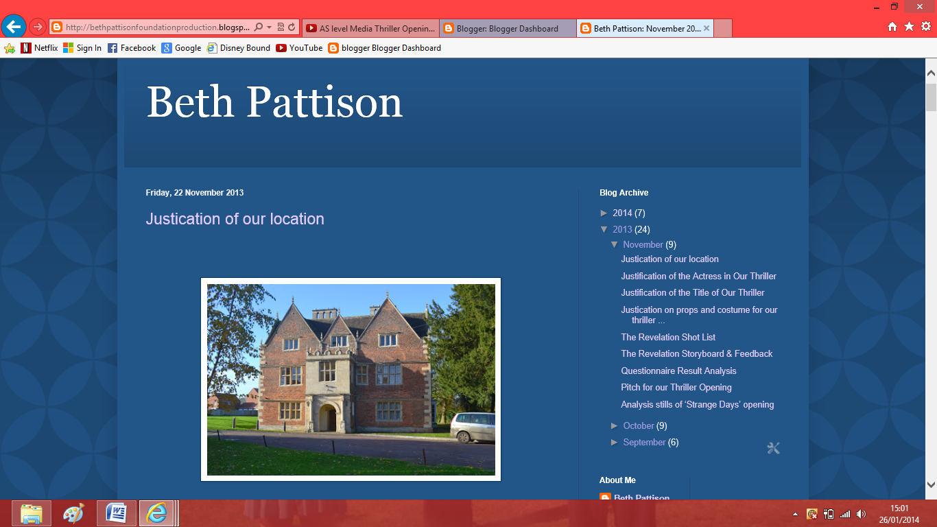
The setting for 'Seven' is a big city, which make it harder to find the serial killer and makes the whole film seem more realistic. We couldn't do this as we live in a small town and we don't have any big city nearby us. However in the opening of seven the first murder takes place in an abandoned, dirty house which we thought instantly created an atmosphere and helped to suggest what type of film this was going to be. So we filmed in a 400 year old house called The Red Hall. In which we emptied out all of the furniture  and in one of the rooms we placed lots of rubbish, fake blood, a matters and old sheets to suggest that the house was abandon (other than the person who own that room) and it was poorly looked after. By doing this it instant get the audience interested  in what is happening- as this is a normal thing to be doing, especially in our opening with a girl looking around. Also I think it make the audience feel uncomfortable as it not a nice place to be and as she is by herself, the audience will start will start to realise how much danger she could be in.  When the detectives look around the room, it makes the audience start to ask question like what has happen here and who has been in here and I believe our opening does the same as  it is such an unusually location.

Props
In Seven the key props was the weapons, as they were the things that killed people and showed the audience the real danger of this situation. Also it made the audience feel uncomfortable to watch as they know the potential damage that can be done with them. We chose not to show the weapon in our opening as we wanted to keep the girl's death a mystery until she actually shot.  But we were inspired to use a gun from Seven as it not a normal item to have, especially in Britain so when one is used it instantly create fear for the audience and helps to show what type of person would actually own a gun and use it. So it suggest in our opening that person who owns the gun in properly a criminal and a bit insane to be able to shot someone dead (like the serial kill in the Seven). We changed how this prop is usually used in a thriller films, as the antagonist normally threatens the protagonist/victim before shooting. Where as in our opening we chose not to show the gun or who was firing it, the audience only hears the gun shot noise. We did this because it keep the death and shooting a secret, making surprising and shocking to watch. Also by doing this it added a huge plot twist to the story as the audience would expect that girl to be the main character and it create mystery, as the audience don't know who fired the girl.

Sound

The sound in Seven was (other than dialogue) was non-diegetic sound effects. The scene which we thought the sound was very effective was the opening titles. In this there are lots of distorted sounds with no dialogue. It really created an atmosphere and helped to build tension. We were so inspired and found this so effective, we chose not to have any dialogue in our opening and just have none-diegetic sounds playing throughout the whole opening. So in our opening when the girl first enters a high-pitched whistling, this instantly creates an atmosphere. The whistling sound turns into a high-pitched violin sounds as the girl walks up the stairs. When the girl get closer to the room the pitch of the sounds get lower and once she has entered the room the sound becomes a lot darker a serious. This continues until she reaches the table and the sound becomes a heartbeat. This is really important to our opening as the audience will assume it is the girl heartbeat and as she get killed after this sound, it actually the last time her heart will beat, which will make the audience sympathize with her even more. When she is killed, we made the gun shot sound twice as loud as the other sounds in our opening, this makes it more shocking and surprising for the audience.  After the death the sound that plays is very peaceful and sad to really bring out the emotions of the audience and help them understand just how upsetting this situation is.

Title


For the title of our film 'The Revelation' we didn't get the inspired from any other Thriller film. We wanted to create something really original and new, so people wouldn't think it was similar to any other film. The way we presented our title in the film was also original and not similar to any other films. The title of the film is usually added in editing, where as we actually film our title. We did this because it made the title of the film more significant to the storyline and related well to what was happening in the opening with the newspaper clippings. 

Camerawork

With camerawork, we didn't really follow the convention of lot high-angle and low-angled shot or have an establishing shot of the location as it wasn't necessary to our opening. However we did do something similar to 'Psycho'  were there is high-angle shot of the dead girl which panes onto another thing of importance. We felt this was a very effective piece of filming because it made the victim look even weaker and made the audience sympathise for that character even more. Then by panning camera across to another thing that is significant to the story helps to suggest to the audience the reason behind there murder. So in our opening the camera panned to the girls wrist with the bracelet on, as this was the same bracelet the dead girl wore in the photos.

Editing

For our editing, 'Psycho' was once again a huge inspiration on how we film and edited our opening. In 'Psycho' the editing begins very slow pace, then it became a bit quicker start to build as she enter the showers and once the killing is taking place the editing is very fast-paced, showing the audience a lots of distorted shots of the killing  in a very small  space of time. For our opening, we did something very similar. As the girl is walking around the house and into the room it is very slow paced than just before she is shot, the editing get very fast pace showing different shots of the room, the photos and the doll. We did this because it create so much tension and when watching it and shows the audience that something bad is going to happen but they don't know what (which also helps to keep the shooting a surprise and shock).

Genre

The genre for our opening was psychological with religious element in it.  To show this we had an old fashioned doll that kept appealing throughout the whole opening, making it a visual motif. The fact it keep moving, even though it is an object makes the audience question if there is life in the doll and if has anything to do with the death of the girl. All of which could question someone sanity.  Another way we introduced our genre was by having creepy, suspenseful music playing which increased as the tension of the storyline increased. This is done in ‘Shutter Island' for example when a disturbing character is shown, the music increases. This was really effective and helps to create an atmosphere for the audience so, chose to do the same.